What I learned about the brain from animating it

About a month ago, I met Joe Palca, NPR science correspondent extraordinaire.  He has a series of very short science segments that fill little gaps between other stories, and since these segments fill holes, he decided to make them about holes as well.  There was one on what would happen if you could throw a ball through the center of the Earth, another on donuts, and one that asked a philosopher to tell us “What is a hole, really?” – you get the idea.  Anyway, through a confluence of circumstances, I teamed up with mutual friends Rachael Porter and Genevieve Jones to make a video that could tie into one of these pieces on holes, and (voilà!) this is what we came up with:

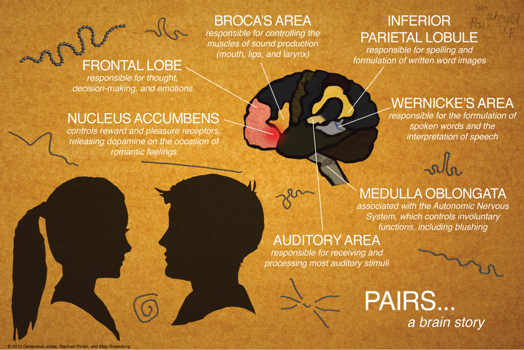
Joe’s piece, which aired this past Tuesday, was about homophones, and his example (going with the theme) was “whole/hole.”  Rachael, Gen, and I decided to do something a little different, and we came up with a love story based around a single sentence containing an ambiguous word, “pair.” We wanted to know what has to happen in the brain from the moment you hear a sound that turns out to be words through the moment you understand what the words mean, and our cute, creepy, silly video is our interpretation of what we found when we looked into the literature.

I’m a planet scientist, not a brain scientist, so I’m sure (and the YouTube comments assure me too) that there are some things we could have done differently when it comes to the details of brain functions.  My hope is that it’ll reach a broader audience than a lot of the videos I’ve worked on in the past – it’s certainly different! – and encourage people to think about how incredible it is, really, that our brains are constantly interpreting all of the many signals we send it in (essentially) real time.

PAIRS...a brain diagram

In any case, though, I wanted to share some of the amazing things I learned about the brain while researching the video.  Since this isn’t my field of study, it was pretty tough going through some of the papers (cited below), but it was worth it!

  • When you hear spoken words, it takes your brain longer to interpret the ones that have multiple possible meanings (homophones) than to understand the unambiguous ones.  Ok, not surprising.
  • When you’re reading words on a page, ambiguous words (homonyms) actually have a processing advantage over unambiguous words.  WHAT? So interesting.
  • Learning to read changes the way your brain processes spoken words by involving the area that controls spelling and visual word images (along with the language comprehension areas). Once you learn to read, your brain is different forever. Whoa.
  • It’s not really known whether all these regions of the brain in the “language loop” (Wernicke’s Area, Broca’s Area, Inferior Parietal Lobule, etc) are activated one after the other in a sequence or if it’s more like a network, where activating one piece activates everything else all at once.

Ok, that’s it! I learned a lot more about language and the brain than I knew before, and some of it was really unexpected.  That, along with getting to work with new awesome collaborators and pushing myself to try new things animation-wise, has made this whole experience worthwhile.  Thanks, Joe!

Some sources (these are the ones we came across and read – certainly not the only ones that are relevant!)*:

Academic Papers:

We also made use of a few online resources, especially for visual references to the brain:

*Special thanks to Dwayne Godwin for pointing out that last webpage, as well as a few other references to studies on romantic love, pair bonding, and fMRI methods.

Posted in Extra Credit, Reflections

More Info & Transcript for “Rebound”

I chose this topic (post-glacial rebound) because it combines a lot of subjects that I really enjoy learning about – orbital cycles, glaciers, geophysics, etc.  It has nothing to do with my own research (in science or history of science), but I thought it would make for a good short video.  I also just think it’s so cool that the Earth is still adjusting to the retreat of the ice sheets – it’s one of the reasons I went into planetary science in the first place!  I drew all of the images in the video, but I based them on several source figures that I’ve included here.  If you liked the video, I’d also highly recommend that you read Richard Alley’s Two-Mile Time Machine.

Transcript:

Rebound (An Earth Story)

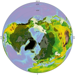
The current and past extent of the ice sheets is based on this figure.

Current and past extent of the ice sheets.

Once upon a time – only a moment ago, really, in the grand scheme of things – the Earth was a very different place.  Her continents were covered with ice sheets thick that scoured the landscape into new and fantastic landforms, and ocean levels were low, with all that water locked up in ice.

This was the last glacial maximum.

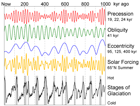
It had happened before – several times, all throughout the current Ice Age, which began 2.6 million years ago. Tugged by unseen forces, Earth constantly squirms in her orbit, shifting the tilt of her spin axis and nudging the shape and orientation of her elliptical path.  All of these changes happen at their own assigned frequencies, and they all add up to pattern of more and less light received from the Sun, more and less intense seasons.

Milankovitch Variations

Milankovitch Variations

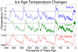
When temperatures are low enough, more ice accumulates during the winter than melts during the summer, and permanent ice sheets can grow.  This temperature record is written right into the ice.  The annual layers of deposited snow capture different amounts of oxygen-18 – a much less abundant, heavier cousin of typical oxygen-16 – and that depends on the temperature.  We can measure these differences in ice cores and reconstruct hundreds of thousands of years of climate history.

Ice – kilometers of it – weighs a lot, and the continents bent under the load, which was too large and too widespread to be supported by the rigid lithosphere alone.  Instead, the land subsided under the ice sheets, and Earth’s mantle shuffled out of the way to accommodate the extra weight.  Rocks are solid – even at great depth – but with enough time and under pressure, they will deform and even flow, just like a fluid, but on a much longer timescale.

The ice had been building up for tens of thousands of years – plenty of time for Earth to adjust – and, like an iceberg floating in water, the continental glaciers depressed the landscape just enough to compensate for their added mass.

Ice core temperature records

Ice core temperature records

But all of that was about to change.

The retreat of the glaciers happened much faster than their accumulation – too fast for Earth to react in real time.  When all that ice suddenly disappeared, it threw everything out of equilibrium again.  First there was an immediate response.  Some of the stress from the weight of the ice had been stored elastically in the rock, and as soon as it was removed, the land bounced back like a tennis ball.  But that was only part of it.  The viscous mantle takes a longer time to respond to sudden changes – in fact, it’s been slowly adjusting ever since, and it still has 10,000 years to go! This post-glacial rebound (or glacial isostatic adjustment) is causing parts of Canada and Scandinavia to rise by about a centimeter per year, and by measuring these movements, we gain important information about the material properties of Earth’s mantle!  It’s hard to run a planet-sized experiment, so when it happens naturally, everybody wins!

Now THAT is a huge (stress) relief!

A couple more links:

  • The ‘glacial features’ drawing was drawn based on this image.
  • I created the background by modifying this one, free from Church Media Design.
  • The music is “Make It Easy” (licensed from PremiumBeat.com, by user Rimsky)

Finally, I want to thank a few people for watching an early draft and making some really insightful comments:  Jon Wolfe, Crystal Dilworth, Laurence Yeung, Jorge Cham, Matt Siegler, and Ben Sveinbjornsson – thanks, guys!


Posted in Uncategorized

Rebound: Outreach and AGU

As a planetary scientist, I go to scientific conferences on a regular basis, and one of those conferences is the annual meeting of the American Geophysical Union (AGU).  When I’m there, I’m usually stressing out about lots of things:  my presentation, navigating the ridiculous number of sessions running in parallel, meeting up with everyone I want to talk to before the week is over, etc.  To me, AGU means SCIENCE – an almost overwhelming amount of it – and (so far) it has had nothing to do with my forays into outreach and science communication. In fact, this conference (and all other conferences, really) has been a place and a time to put my other interests aside and act like a real scientist, a serious one that doesn’t spend her time on outreach (or history of science for that matter).

So when I heard about the AGU Student Video Contest a few weeks ago, I had to consider very carefully whether I wanted to enter.  On the one hand, I’ve been trying to keep my amateur video- and animation-making out of my work life.  True Anomalies and my other PHD TV projects have been an outlet for me, and I’ve learned a LOT in the last several months about communicating ideas to a broad, and sometimes not-so-broad, audience.  I think these lessons I’ve learned are good for my academic life – I’m better at sorting through information for the important bits and more confident at speaking, for example – but by and large I don’t think the academic world agrees with me.

There are consequences for academics that engage in too much outreach.  That’s just how it is.  At least, that’s what I’ve gathered from the SciComm community since I got started with all of this, and it’s what I’ve been hearing from friends and colleagues since I entered grad school.  I understand why outreach activities might affect hiring and tenure decisions – I mean, people are just making these decisions in a way that makes sense to them in the moment – but it makes me sad that giving back to the public (especially as publicly-funded scientists!) is seen as a lesser activity, or even a waste of time.  What is it about engaging a broader audience that makes one less serious as a researcher? Why is ‘seriousness’ the metric of a good scientist at all?

These issues have been on my mind a lot lately, and that’s why, when I saw the announcement for AGU’s video contest, I paid attention.  It’s not every day that a scientific professional organization actively encourages its members to embrace their creativity and reach out to the public.  I’m pretty proud that mine does, and I think it deserves support.  I don’t know if entering this contest will have any negative ramifications for me – I hope not, but I think it’s a possibility – but I’m glad I did it anyway.  It just feels right.

[All three contest finalists can be viewed here.  The winner is decided by YouTube ‘likes’, so vote for your favorite! (and it doesn’t have to be mine!) Voting closes August 4.]

Posted in Extra Credit, Reflections

Teaming up with TrowelBlazers

I recently came across this new effort to showcase female researchers in throughout history in archaeology, palaeontology, and geology: TrowelBlazers! Today, they were good enough to post an entry I wrote about Marie Tharp, a geologist and drafter who, with Bruce Hazeen, compiled ocean sounding data into the first maps of the ocean floor.  Writing for TrowelBlazers was really fun, as was learning about Marie’s life and work – now if only I could find some free time to do it again!

Posted in Extra Credit, News

Partial Lunar Eclipse

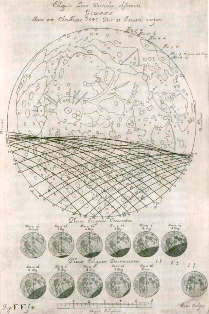
Observations of a partial lunar eclipse on January 20, 1647:

Johannis Hevelii Selenographia - lunar eclipse - 633

From Hevelius, Selenographia, 1647

Posted in Extra Credit, Images

Jupiter and the Moon

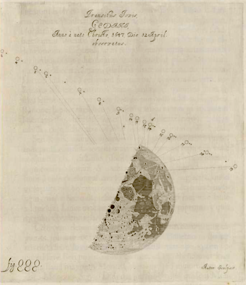
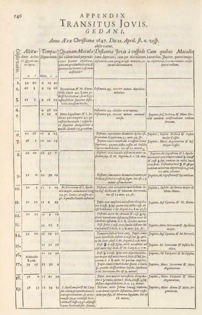
“Transitus Jovis” – the passage of Jupiter close to the Moon on April 12, 1647:

Johannis Hevelii Selenographia - transitus jovis-757

Based on these observations:

Johannis Hevelii Selenographia -transitusjovis -756

From Hevelius, Selenographia, 1647

Posted in Extra Credit, Images

How do you measure a mountain on the Moon?

astronaut-jakestaff-textcap

Today, we have lots of tools1 at our disposal to examine the topography of our nearest neighbor, but measurements of lunar mountains were being recorded long before the development of satellites, space travel, and photography.  How was it done? With a keen understanding of light and shadow and a whole lot2 of geometry.

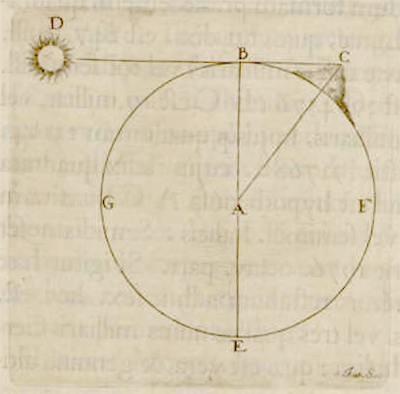
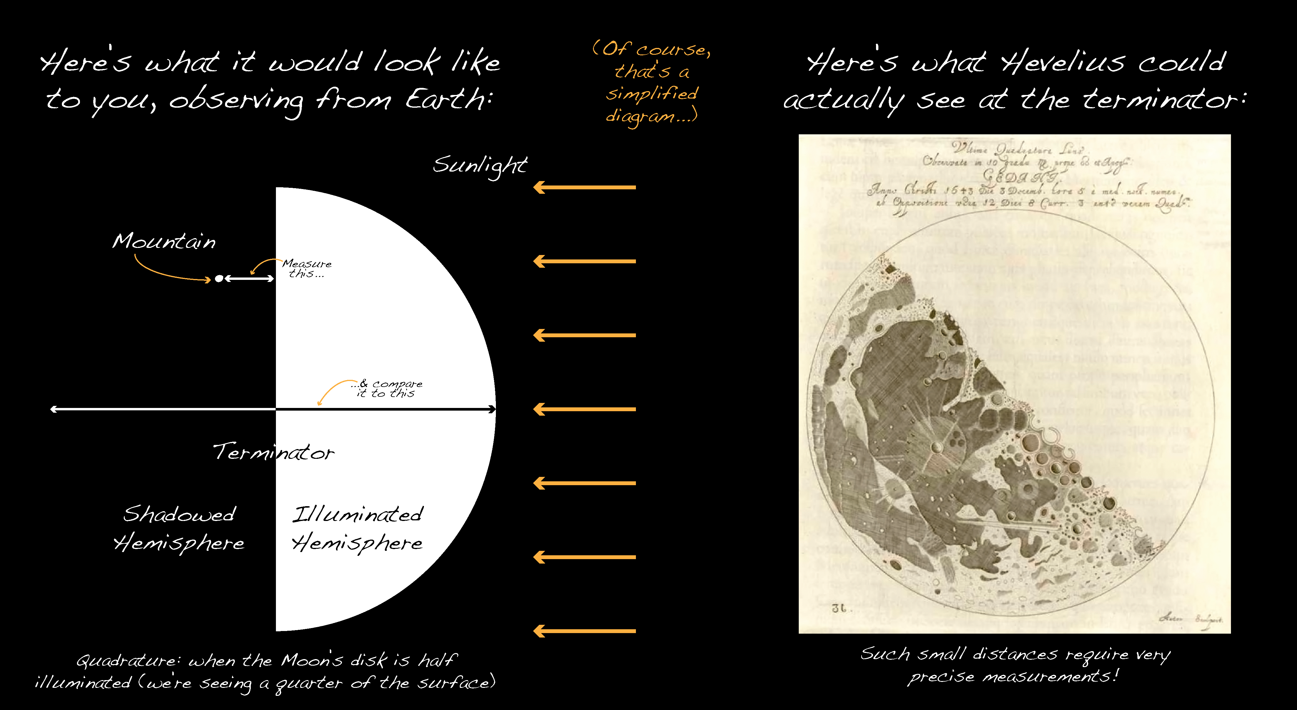
The earliest method I’ve come across, used by Galileo, Riccioli, and Hevelius in the mid-17th century, relied upon a game-changing realization:  the shifting pattern of light and dark at the Moon’s terminator (no, not a futuristic killer robot, but the line separating “day” from “night” that sweeps across the lunar disk, creating the familiar phases of the Moon) is caused by sunlight interacting with peaks and valleys.  If a bright spot appears beyond the terminator, surrounded by blackness, it must mean that a mountain stands there, its height allowing the peak to catch the sun’s rays while everything around it is shadowed.  Hevelius took advantage of this situation to calculate the height of select mountains when the Moon was at quadrature – half illuminated as viewed from Earth. In his figure (left, from Selenographia), the illuminated hemisphere is bounded by the letters BGEA, but the hemisphere viewed by the observer is BGAF.  We see a disk half light and half dark, and a ray of light, DBC, just skims the edge of the Moon to hit the peak of a mountain at C.  This geometry is special because the ray of light is perpendicular to our line of sight.  That means that the distance between the terminator and the mountain (BC) can be directly compared to the diameter of the Moon because you’re seeing it straight on, while at any other angle this distance would be somewhat foreshortened. Once you have that ratio – the distance BC over the lunar diameter – you know the lengths of two sides of the right triangle, and all you have to do is calculate the hypotenuse, CA, and subtract the lunar radius to get the height of the mountain itself.  Done!

HeveliusQuadrature

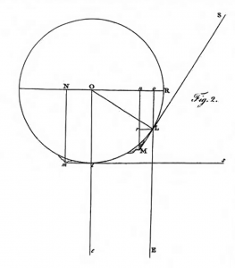
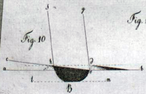
herschel-fig2More than a century later, in 1779, William Herschel adapted this method to make use of observations “that were made when the Moon was not in her quadrature” but at nearly any phase.  All it takes is recognizing that the distance measured between the mountain and the terminator – now viewed at an angle and therefore appearing shorter than it is – can be related to other known distances that make up the sides of similar triangles.  In Herschel’s drawing, the similar triangles are oOL and rLM, and the distance you want to measure is LM, the actual distance between the terminator and the mountain peak, so:

herschel2


LO is just the radius of the Moon, on (the same as rL) is the apparent distance that you measured, and Lo is simply related to the angle of the Sun at that particular lunar phase – something you’d look up in a table, or ephemeris, for the given date.  Once you have LM, you can make a right triangle with LM, OL, and OM and use the Pythagorean Theorem again to find the height of the mountain.

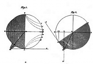
Here’s a comparison of the two methods from the 1832 Edinburgh Encyclopaedia, which shows the illuminated and shadowed hemispheres in each case:

edinburghencyclopaedia-herschelfig-med2

In both figures, the observer is positioned at the bottom, marked (illegibly, due to the scan quality, I’m afraid) by a small letter ‘O’.  The first observer sees the Moon at quadrature, half lit, while the second observer sees a crescent.

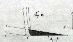
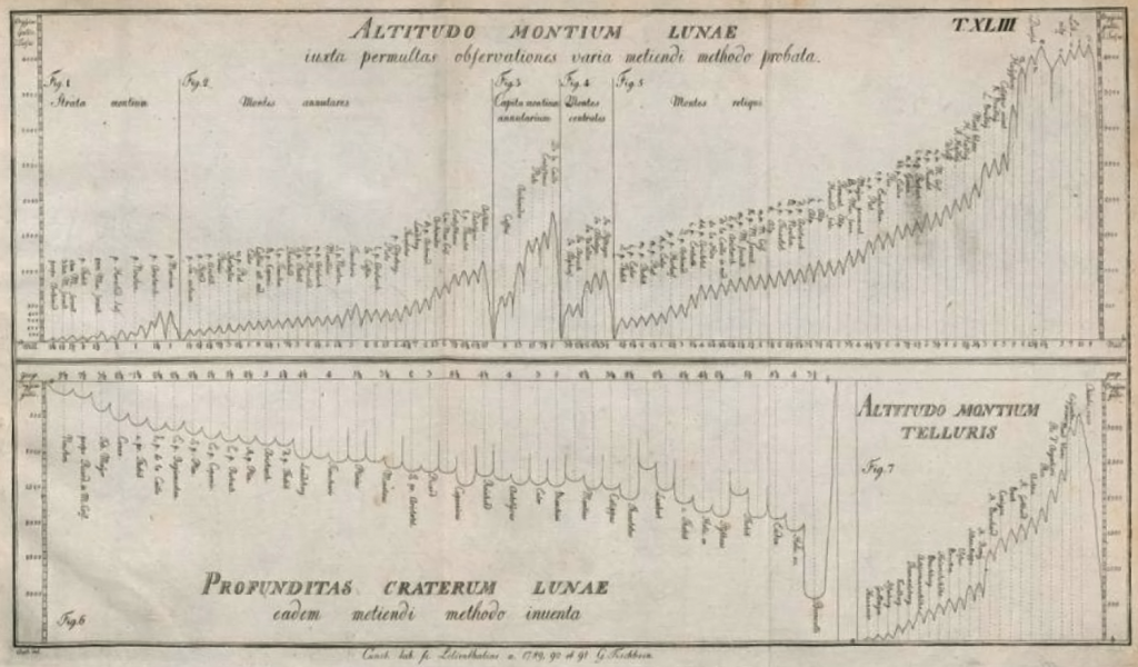
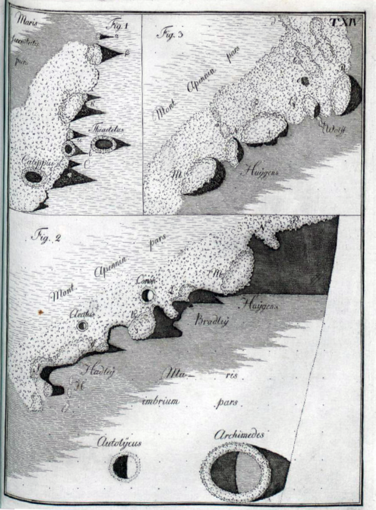
That’s all well and good for a few tall mountains, but it wasn’t good enough for Johann Hieronymus Schroeter, a German astronomer who came up with a new method for estimating the heights of Mondberge (of course German has a single word for “Moon mountains”!): measuring their shadows.  He realized that once you know the distance between the mountain and the terminator, you can work out the altitude of the Sun above the horizon, and from there you can translate the length of a shadow into a height! What’s more, you can use this technique to study the topography of any feature – not just mountains – and Schroeter made the first quantitative study of lunar crater depths.3 Here are a couple of illustrations from his 1791 monograph Selenotopographische Fragmente, as well as a compilation of his height and depth measurements:

schroeter1a schroeter1b


schroeter4

The last 50 pages or so of Schroeter’s book are filled with detailed sketches of rugged peaks, abrupt plunges, and lengthening shadows. His is a Moon of exaggerated relief, sketched at the boundary between day and night (a place, not a time!), where the Sun hangs low in the lunar sky and projects fantastical shapes that nevertheless contain precious information about the true shape of things.  His sloping plains and forest-like crater rims also betray Schroeter’s optimism that life might exist on the Moon; looking at his sketches, I can almost believe it myself:

schroeter3

We’ve developed many more ways to study the topography of the Moon in the 200+ years since Schroeter peered through his telescope, and several of them still rely on understanding the interplay of light on rough terrain – but that’s a post for another day.  The next time you look up at the Moon (as long as it’s not full or new), take a good look at the terminator, and think about how you might measure your very own mountain.  That’s what I’ll be doing.

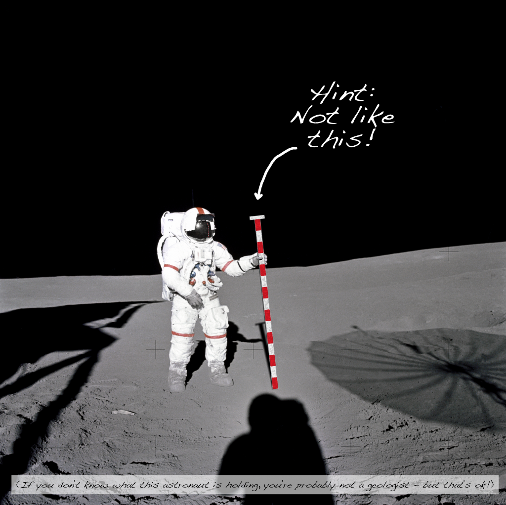
  1. One of those tools (in theory – it’s not very practical in those suits!) is the Jacob’s staff (added tactlessly to the Apollo photo above), a geologist’s means of measuring vertical thicknesses of rock layers in the field.  As you walk up the hill, you use a compass to level the Jacob’s staff and sight to the next place on the hillside, which is higher than the place you’re standing now by the height of the staff.  Then you walk to the place you sighted and do it again, and again, until you’ve measured the whole layer (p. 16 of this textbook has a good diagram).  Once you know the real thicknesses of the strata (which might be different than what you can see exposed at the surface because of how it’s been eroded or the tilt of the layers), you can construct a stratigraphic column – a schematic sequence of layers and their thicknesses that helps you figure out what happened geologically in this place and how it correlates with other places.
  2. Actually, “a whole lot of geometry” is surprisingly little! I find it really inspirational that these measurements and calculations are so accessible.  In my search for primary sources, I came across many lesson plans that incorporate one or more of these techniques – what a great idea!
  3. Schroeter was also the first to use the word “crater” to describe the features that he saw.  From the Greek for “bowl,” it had been used to describe the caldera of a (terrestrial) volcano by others, but before Schroeter it had never been applied to the Moon. (Whitaker, 2003).
Posted in Extra Credit, Images

Phases of the Moon

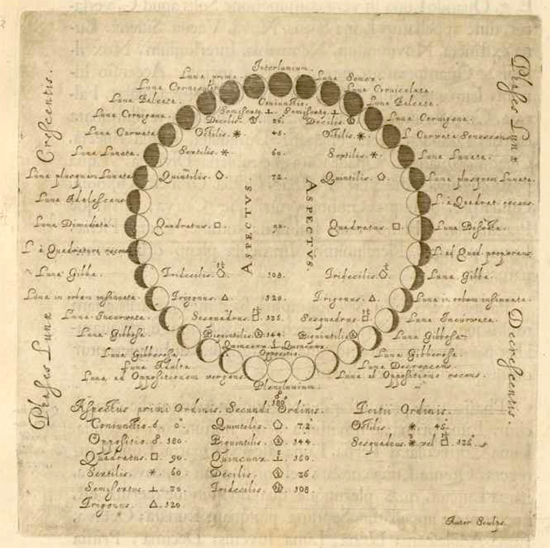
Phases of the Moon – Hevelius, Selenographia, p. 182:

Johannis Hevelii Selenographia - moonphases - 241

Posted in Extra Credit, Images

More from Hevelius – “tres Valles, altissimis Montibus circundatæ”

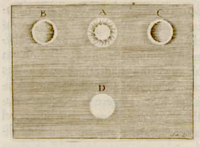
Last week, while looking for the largest/clearest/awesomest version of the Moon map that I posted, I got totally sucked into the book in which it appears, the 1647 Selenographia of Johannes Hevelius.  While the image quality of the scanned book isn’t great, I thought I’d share a few of my favorite figures anyway.  Since I study craters (a word Hevelius never used, to be clear), let’s start with this little sketch that appears on page 257:

Johannis Hevelii Selenographia - illuminated craters - 324Hevelius says that A represents the Sun, while B, C, and D are “three valleys, surrounded by the highest mountains.”  When the Sun is directly overhead , the valley is completely illuminated (represented by D), but when the Sun shines obliquely on the valleys (B, C), there are shadows that depend on the geometry.  Observing at different times catches these shadows in different positions, making it clear to Hevelius that variations in brightness, in this case, are caused by topography rather than differences in the actual color of the surface.  The same is not true, he points out, of the “Maria, Lacus, & Paludes” (seas, lakes, and marshes – the darker mare plains), which generally retain their dark color even at high sun angles.

So cool! It might sound pretty straightforward, but understanding whether brightness variations on a remote planetary surface are due to actual differences in the properties of the material (albedo) or are instead due to shadows cast by topography is still a fundamental task in remote sensing today.  We have a lot of information about the Moon now, what with all of the recent missions, but that’s not the case for most places in our solar system, where photographs from passing spacecraft are the primary, if not only, data available.  When we look, for example, at the icy satellites of the giant planets and try to figure out what the landforms on their surfaces – which are pretty strange-looking, by the way – tell us about past and present geologic processes, we need to know first what’s topography and what’s albedo variation – and in that, we’re not much different from Hevelius.

Posted in Extra Credit, Images

It’s Friday! Here’s a Moon map.

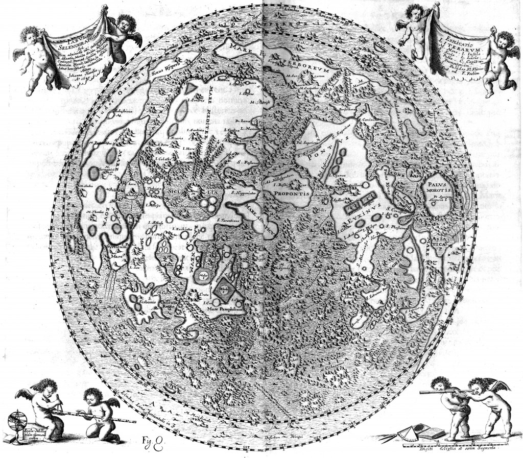
This map of the near side of the Moon was published in Johannes Hevelius’ 1647 book Selenographia. You might notice that it covers slightly more than one hemisphere.  Hevelius recognized that the Moon librates (in both longitude and latitude) as it orbits the Earth, letting us peek at an extra 9% of its surface.

Johannis Hevelii Selenographia

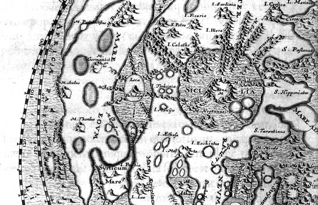
I love the detail on the mountains – it reminds me of Middle Earth, and really it’s only slightly less fictional (at least, compared to our observations today).

Johannis Hevelii Selenographia

There’s a scanned copy of the whole book (in Latin) available online, but I found this version at higher resolution in the International Planetary Cartography Database.  Curious about the names Hevelius uses? Check out this brief history of lunar nomenclature by thonyc, or Whitaker’s very thorough account in book form.

Posted in Extra Credit, Images